5 Advanced Responsive Design Tips For Perspective
People expect applications on their mobile devices to load quickly, scale with how they’re accustomed to using their devices. Likewise, they also expect a seamless transition to a tablet or PC once they put their phone in their pocket.
With the addition of the Perspective module in recent years, Ignition has become a powerful platform capable of supporting complex applications with modern design sensibilities.
While it may not be obvious HOW to build a responsive application without some trial and error, we wanted to share what we have learned over the past few years of building many fully responsive Perspective applications at Corso Systems.
1: Containers Matter
Containers are the foundation of development in Perspective. Each view is a container with components embedded into it. Containers essentially act as the “background” of what you see in your browser. You can embed containers within other containers to make dynamic screens and to group components in various ways.
Perspective offers six different container types to use for your views.
A term we will use in this post that might be new to you is “Viewport Width”. This refers to the screen size in pixels that you are using on mobile/tablet devices, or the width of your browser window on a PC. You can also resize the browser window on a PC to see what your views look like at different Viewport widths.
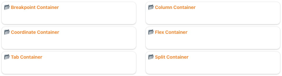
Breakpoint Container
A Breakpoint Container is basically two views in one. You set a breakpoint size (eg: 600px) for your screen or browser width. When a screen/browser window is smaller than this width, Ignition will display the smaller view. When the screen/browser is larger than the breakpoint, it will display the larger view.
This is useful if you want to show one view to users on browsers or tablets with larger screens, and use entirely different components on a mobile device.
A typical use case is to have a P&ID style screen in the larger view, then a card-based view shown on mobile devices.
The one downside to using Breakpoint Containers is you will have two views you have to manage when making changes to your application.
Column Container
Column Containers are similar to many typical web development frameworks. It has a 12-column wide layout with components mapped to various columns at different Viewport widths. This will let you design a wide layout for a larger screen, then a stacked layout for smaller screens.
Within the column container you can also set up multiple rows giving you a comprehensive grid layout on your screen. Individual column widths will scale based on the size of the Viewport giving you some responsiveness out of the box.
Unlike a Breakpoint Container, the Column container uses a single set of components, so you only have one view to manage.
Column containers are great for “typical” web application style systems with forms, dashboard components, or other items which can benefit from a grid-style layout.
The downside to a column container is it can be problematic to build views where components don’t fit into the column layout. For example it’s not an ideal container for P&ID style screens.
Coordinate Container
The Coordinate Container is nearly identical to a window in Vision. It lets you add components in the container with specific coordinate locations and can scale based on Viewport width by percentage. As you scale the size of the window from 100% on a PC to 30% of the full width on a mobile device, everything on the window will scale down 30% in size, and the relative coordinates will automatically adjust as well.
Coming from a Vision developer’s perspective, Coordinate Containers are the easiest to understand even though they are the least responsive option.
The most common use case for Coordinate Containers are P&ID style screens. Most views made with Coordinate Containers are meant to be used in the context of a control room where the screen size and resolution will remain mostly static.
Flex Container
One of the most common and versatile containers in the entire Perspective ecosystem is the Flex Container.
A Flex Container has a similar ease of use as a Column Container without the limitation of 12 columns. It dynamically resizes components in the Flex Container based on your screen dimensions, and can easily handle both vertical and horizontal layouts.
The Flex Container is the most commonly used container at Corso Systems. Many times we use multiple embedded Flex Containers to provide a fully responsive interface with a single view and set of components.
However, if you’re coming from Ignition Vision or from another SCADA system it may take time to adjust to using Flex Containers. If you are accustomed to coordinate-based systems like Vision Windows, it can be a little bit confusing to wrap your head around a Flex Container the first time as there are a number of options you will need to consider.
But, once you’ve spent a few minutes working with them, you will see that Flex Containers are just a different tool than a coordinate-based view. And there’s a small learning curve with them when you first start developing in Perspective.
Flex Containers are great when you need a fully responsive system and don’t want to manage different sets of components (as with Breakpoint Containers) and when you need more control over your view layouts than Column Containers can provide.
Tab Container
A Tab Container is useful for creating multiple tabs in a Perspective View. This specialized container allows you to embed one component on each tab. Since a single component can also be an embedded view, you still have a lot of flexibility in what you can display.
A Tab Container view functions just like tabs in a web browser. Since there isn’t anything inherently responsive about a Tab Container, we won’t dive super deep into them in this post.
Split Container
The Split Container is basically a dynamic Flex Container that a user can re-size in their browser. The Split Container has locations to embed components with a split in the middle that can grow/shrink both sides of the container. It works similarly to how a Flex Container will grow/shrink the components based on Viewport Width, although that isn’t exposed to the user to do it themselves in the session.
The Split Container is the least used Container at Corso Systems and like the Tab Container is not inherently responsive so we won’t go into more detail in this post.
2: Swap Embedded Views Dynamically
An often overlooked aspect of responsive design is the usability and user experience of an application. People are accustomed to mobile apps with fast load times, and great design. They also don’t expect to need to break their workflow while in an app.
If you are familiar with loading Perspective for the first time in a browser session, you’ve seen the loading screen. While most sessions will only show it once, if your navigation strategy isn’t designed well, it may load often for your users.
While most sessions won’t pull up the loading screen, a new view can take a while to load when using a navigation option like the menu tree to get to a different view.
One way we have reduced load time and improved usability is by using embedded views and swapping between them with button presses. This approach approximates a tab view concept while giving us full control over the look and feel of the interface. You can easily see this approach in action on our Opto 22 groov RIO EMU Faceplate project on the Ignition Exchange.
This reduces overall loading times by only changing one component on a screen at a time, and allows for detailed navigation strategies in a project.
3: Fully Dynamic Text Scaling
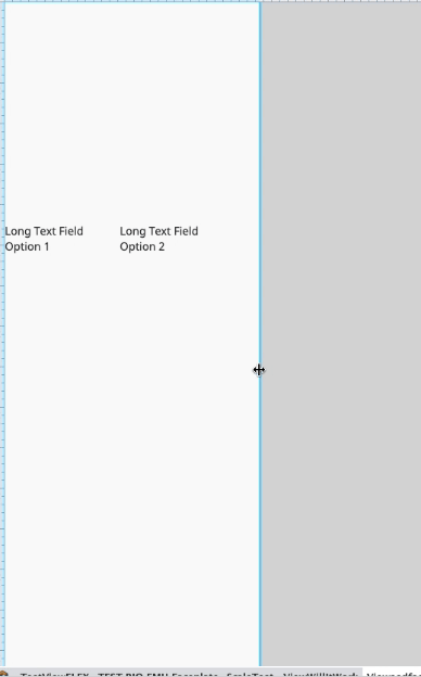
Another often overlooked feature of responsive design is font scaling. By default, even when using a Flex Container, font sizes do not scale in Perspective. However, they can be set up to scale in different ways using CSS and Style Classes.
Managing font sizes in a dynamically sized application can be tricky. For example, if you use a static value of 16px for your font size, your screens might not look right on mobile devices. To adjust for this, we’ve found that the best approach is using CSS and Style Classes.
Style Classes allow you to essentially build a “template” for your Perspective components with relevant CSS properties. Primarily, Style Classes are how we use CSS in Ignition. You can also set up specific CSS stylesheet files your application will use. This is common if you are using features like Dark/Light mode in your applications.
There are two common approaches for implementing dynamic font sizing in Perspective. One is to use Media Queries to set up specific CSS styles based on the size of your screen, and the other is to set up individual style classes with dynamic values for setting your font sizes based on your screen size. The first approach is easier for explicitly stating font sizes, but requires making more changes in more places if you need to make adjustments. This is because you need to adjust each Media Query individually. Setting up individual style classes will require less maintenance if you need to make changes, but doesn’t provide as much control over the end result.
Media Queries
To dynamically scale text with Media Queries, open up the Style Class panel, and click the + button to add a Media Query. You then set the minimum width for this Style Class and enter your values.
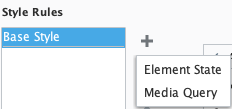
In this case we would set our font size to 10px if our viewport is greater than our minimum width of 300px. We can add another media query to change the font size to 16px if the screen width is greater than 1000px. There are more options for the type of media query if we want to check for screen orientation on mobile devices to show different styles for vertical or horizontal orientations.

With Media Queries, keep in mind that you will want to set a backstop value that is less than what you might expect the screen to ever be. If 800px is your minimum value across all the queries, then scale the browser down to 500px you will see odd behavior!
Calculated Font Sizes
The other approach you can take without the additional entries with Media Queries is to use variables in your Style Class, or even calculated values based on your screen size.
You have a number of options here including em, vw, vh, and %.

The easiest approach to scale fonts is using the vw unit. This will make your font size 1% of the viewport width multiplied by the value you use, in this case 1.6vw. This means our font size would be 16px for a viewport width of 1000px.

The limitation of this approach is your font can scale down to unreadable levels when your browser is at its lowest width if it is readable at normal sizes, or can grow to gargantuan sizes if you your fonts are optimized to be readable at smaller widths.
If you expect to use your app only on tablets and PCs and don’t need to handle lots of different resolutions, you can use a clamp() CSS function to clamp the values to a min and max range with a specified value in the middle. This will keep your smallest and largest text sizes readable while also scaling to look good on both resolutions.
font-size: clamp(16px, 4vw, 22px);
You can also use a calc() CSS function for more control over the size of the text by combining preset values with the variables described above.

Using the right choices for your applications will give you access to responsive text in your applications, giving your users the look and feel they would expect in modern mobile apps.
4: SVGs
When building responsive projects you will want to use SVGs wherever possible instead of non-vector (rasterized) graphic images. SVGs can scale along with the size of your views and devices. They also allow you to control colors, styles, and about every aspect of their appearance dynamically with bindings.
Preparing SVGs for Ignition:
When choosing or using SVGs, we’ve found a few especially helpful strategies for preparing them to work well in Ignition. The following recommendations are not set in stone, but we have found them to be especially helpful. One of our Systems Engineers, Adrienne Harvey, has many years of experience with Adobe Illustrator and used it for the examples below in this section, but you can also implement all of these practices in Inkscape. She’s included the instructions for both programs in this SVG topic section. We used SVGs in our ICC Build-A-Thon Project as well!
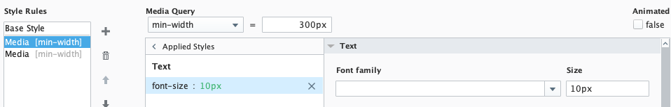
Sizing and Artboards:
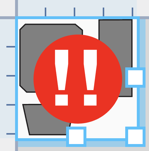
Make sure that before using an SVG in Ignition that you’ve removed any extraneous whitespace around the drawing itself. Doing this will allow you the most flexibility and most predictable resizing in Ignition containers. Otherwise you’ll need to wrestle with the viewport and viewbox settings in Ignition which can sometimes be not terribly straightforward. In Illustrator, you can select the largest path (or you can select all the paths) of your SVG and get Illustrator to fit the Artboard to your selection. In Inkscape, when you’re finished creating your drawing, be sure that the page borders are as close to the edges as absolutely possible (like the examples from Illustrator in the image below). In Inkscape, use the custom size option “resize page to content”.
Simplification and Compound Paths:
The more you can simplify your SVG into one or just a few paths, the less work you will need to do when adding bindings for fill color, stroke width and color, etc. Fortunately, the ideas of High Performance HMI design dovetail nicely with this approach. In Illustrator, a Compound Path behaves as a single path and can be bound as such in Ignition. Depending on the complexity of your design (especially when considering overlapping elements), you may need to have one or more compound paths.
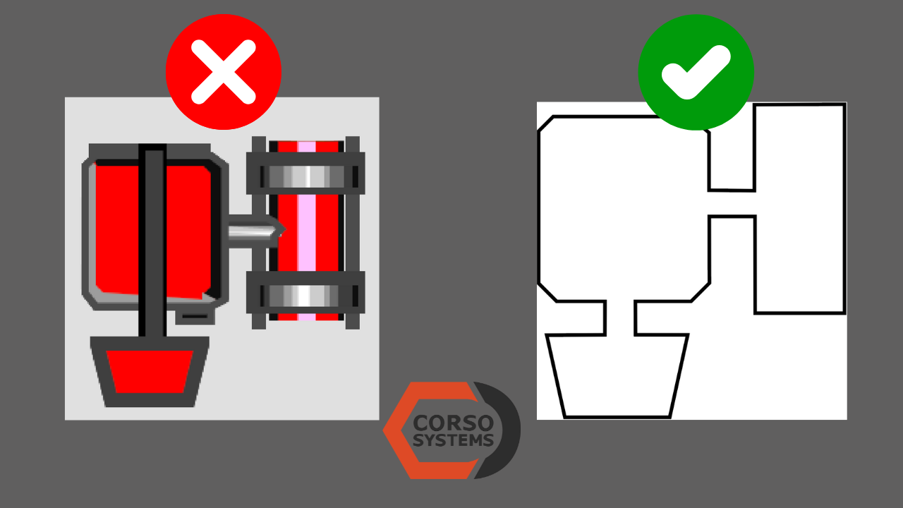
Typically, we recommend having a “main body” that will change color as a base layer and if there are any details that need to be added, they can reside in an upper layer. These paths/shapes will usually will not be bound, so if necessary they can be organized in a Group instead. To help with future development we label the compound paths, groups, and layers with descriptive names when possible so that it is easier to track down where to look when adding bindings, or where to find the bindings immediately. In the example above, we were updating and upgrading a legacy SCADA system. We created a new SVG with a single path to replace the complex legacy rasterized graphic. This new image can now easily conform with High Performance HMI design principles and in the templated view can display an alarm symbol (also an SVG) when required.
Embedding not linking:
This is an invaluable tip from Astraea Leary who is now our Project Success Specialist. When adding SVGs to a given view, you can just drag them in, then make a very important choice: “embed image”. Now you can have access to extremely flexible resizing options and control, especially in flex containers—quickly and without adding another container.

5: Hide What You Don’t Need
Another way to improve the user experience of a Perspective app on a smaller screen is to simply hide what your user doesn’t need to see.
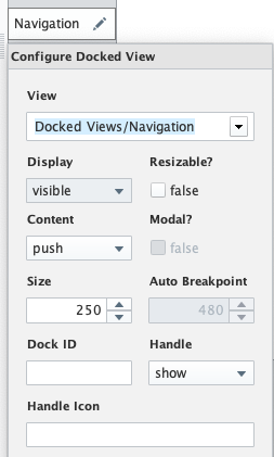
To accomplish this, we use Docked Views and the Handle setting in the Perspective View configuration. In the example image, we’ve set the Navigation window to be a left docked view under Shared Settings, and have the Handle set to “show”. This will give the user an icon to the right of the view that they can use to show or hide it and push the other content to the side appropriately. This is similar to the popular “hamburger menu” you are probably familiar with in most mobile apps and websites.
Wrapping Up
Building responsive web applications is a topic people spend their entire careers exploring and understanding. While this post is not an exhaustive list of all the possibilities for web and mobile applications—let alone Ignition in general—we hope it sheds light on some of the easiest wins available in Perspective.
If there are other things you would like more detail on or have questions about responsive design in the Ignition Perspective Module, please reach out and let us know!
Need Help With An Ignition Perspective Based Project?
Schedule a short intro call with Cody Johnson in sales to get started ASAP
Or Contact Us with your project details.