Chart Annotations in Ignition Reports
Time series charts can be a powerful tool for analyzing what happened over a period of time. But, sometimes you want to highlight particular events on a chart. These callouts can be value driven, based on alarm conditions, or even be pulled from an operator log.
Using the Ignition Reporting Module, you can easily build complex reports with charts, tabular data, images, and just about anything else. Since it is part of the Ignition SCADA package, it has access to many of the features—like scripting—that you know from the Vision and Perspective Modules. We will take advantage of scripting integrations in this post.
What is an Annotation?
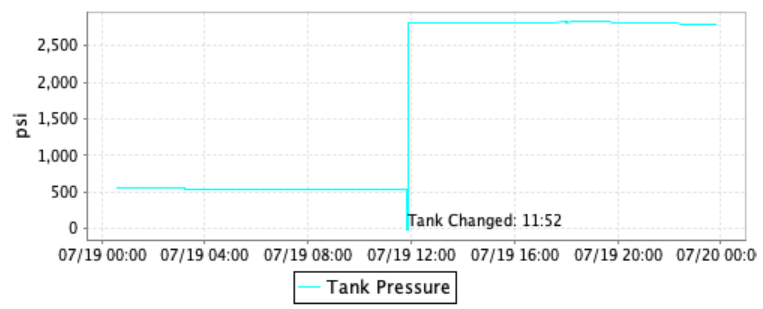
The chart above has a pressure reading over time indicated by the blue line. In the middle of the chart, the line drops down to around 0 psi, then promptly spikes up to over 2,500 psi.
In the real world, this chart shows the pressure readings of a gas supply line in a lab. The supply line is fed by a tank. When the tank falls to 500 psi, it needs to be changed to meet lab safety requirements. When the tank is disconnected the pressure will drop to around 0 psi. Right after they’re connected, the new tanks provide around 2,800 psi of pressure. For the purposes of this report, we want to know what time the tank was changed and add an annotation. The annotation in this case is the “Tank Changed: 11:52” text.
How Are We Generating Data?
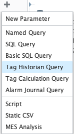
For this annotation, we will pull in the pressure sensor’s tag history from the Ignition Historian. We have a Tag Historian Query data source set up on our report to pull in the pressure—and we are recording both the tank pressure and the line pressure that is fed from the tank.
How Do We Annotate the Chart?
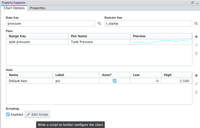
Now that we have the tag history binding set up, we can add a chart to our report in the design tab. Then we’ll bind it to our tag history for the Tank Pressure.
The configuration above will give us the line on the chart. We could also add more lines to the chart if we wanted.
To manage annotations, click the “Edit Script” button on the bottom of this pane to access the script editor.
Opening the script editor gives us the configureChart function. This gives us access to the chart itself as an object as well as to the data displayed on the chart.
First, we’re going to import the following:
The datetime library and Java dates are always good to import if we are using time series data
TextAnchor lets us create the annotation itself
XYText Annotation lets us position it on the chart
SimpleDateFormat allows us to easily format the timestamp to display in the annotation
Next, we get the XYPlot from the chart object, and the dataset from there. We’ll set a max value higher than we would ever anticipate as an actual value, then we loop through the dataset. We set a flag variable, j, to -1 which will set this to the dataset index where the tank was changed if the tank was changed in this timeframe.
Looping through the dataset, we will get the YValue and compare it to our max value. If it is lower, we reset the max. Then, we check if the value is greater than 2500, and if our max value is less than zero. If so this means we have gone through a tank change procedure as the pressure went negative before returning to an expected range for the new tank. If this happens we set the flag for j and break out of the loop.
Finally, if our max value is negative, and we set a value for j, then we will set up an annotation.
To set up the annotation, we’ll grab the timestamp from the X axis in the dataset, and set up a format mask. We set the label value as an XYTextAnnotation. Next, we pass in the string we want for the annotation itself, the X and Y values indicated by the timestamp, and the psi value we want to display with the text annotation. Finally we anchor the annotation to the bottom left of the text field so we know where it will be displayed. Lastly, we add it to the chart with the addAnnotation() call.
When the report is displayed, if a tank change happened during the time period of the report, we will see the annotation displayed as you can see at the top of this post.
Other Text Annotation Options
Other options for adding text annotations can be based on any criteria we desire.
We could query alarms relevant to the displayed data and add in an annotation each time an alarm condition was triggered. We could highlight operator log notes if we query an operator log for the given time period and generate annotations with operator notes at given timestamps.
We could even tie into Ignition’s own Audit Log and display relevant events from it on a chart.
Wrapping Up
Annotated charts can be a very helpful tool when analyzing data. They can provide context based on the data on the chart along with data from other sources to provide more insight into what was happening at any given time.
Adding annotations to charts is relatively straightforward with a little digging into some of the underlying Java framework. It’s easy to see how powerful Ignition can be once you know what you are doing. Annotations aren’t necessarily a “drag and drop” item like building a Vision window, however they are readily available if you are willing to roll your sleeves up and do a little bit of research.


